West End Learning Syllabus Matcher
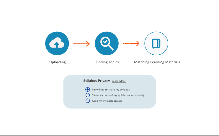
I collaborated with West End Learning to re-design their website for their Syllect Syllabus Matcher user flow. The goal was to make it helpful and intuitive for teachers to upload their syllabus and find matching teaching resources that are vetted by professionals.
The Problem and the Goal:
West End Learning’s previous site needed some minor tweaks and changes to indicate to users what the calls to action were in order to successfully complete their user journey. This was primarily achieved by adjusting buttons, colors, fonts, and shapes from the pre-existing site.
Client
West End Learning
Time Frame
January 2024-March 2024
Audience
Teachers and professors.
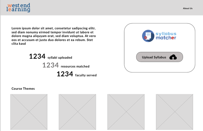
Paper wireframes, Lo-fidelity wireframes, and various iterations of high-fidelity wireframes were created in order to land on the final design for each page.
Conducting Research:
-
After the first draft of high fidelity wireframes was delivered, it ws discovered that some of the bright oranges were difficult on the eyes and needed to be changed to a more neutral color. This went from orange to gray, which made buttons look inactive, and eventually was changed to blue call to action buttons.
-
One of the main focuses for testing was clear call to action buttons, which went over s viral iterations during the course of this project.
Takeaways
This project was all about attention to detail and constant iterations of the same design. I learned a lot about the way that colors impact the functionality of call to action buttons, and about how sizing and spacing make a difference on a webpage for guiding where the user should go next.


